Wednesday, January 26, 2011

Almost normal. . .

While doing my normal daily internet research (I think "internet research" sounds much better than just saying "mindlessly surfing the internet") I found the ads below.


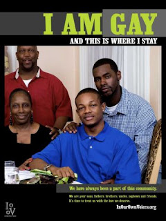
These ads, sponosored by the LGBT group In our voices, have been popping up in Schenectady, NY to the normal din of homophobic rhetoric. Pastors are, of course, up in arms because they fear the following nightmare scenario described by Rev. Alfred Thompkins of Calvary Tabernacle: “A thirteen-year-old looks at these billboards and says, ‘That must be it, I must be gay.'" (Much in the same way after I looked at a Baywatch billboard at the tender age of 13 and thought that I must be Pamela Anderson Lee.)

While I absolutely love the idea of showing more LGBT people of color, I'm not digging these ads. One, they're too hard to read. The color choices for the copy is some shitty neon color that gets totally washed out by the eye and the everything outside of "I am gay" is way to small to see, especially in a billboard. Two, the call to action is hard to read and not clear. Ok, there are gay black people and. . . . what. . am I supposed to call someone, read something, sign something? I have no idea what I'm supposed to do next and without some sort of follow up thing, there would be no way for IOOV to actually judge whether or not these ads are doing anything. Lastly, and probably most damningly, these ads do the opposite of what they are trying to do. These ads are seeking to normalize being gay (which I'm all for) but by placing the words "I am gay" (followed by some really pathetic rhyme) doesn't normalize, it accentuates, it makes them stand out. Imagine if in the family picture ad, the tag said something like "Families come in all varieties in Schenectady" or something like that. I know the lines not perfect but rather than forcing the issue, it allows the connections to be made in the viewers mind. It wouldn't say "I'm here, I'm queer, get used to it" but rather "all are apart of our community".

I long for the day when LGBTQ ads and media no longer exist, not because LGBTQ issues are squashed but because the community is integrated completely. I'd want to see an action movie where the lead just so happens to be gay, or a soda commercial where the lead just happens to be be trans. I think the key to normalization is not in saying "where all around you" but in saying "we are you".

Wednesday, November 10, 2010

Back from vacation

Wow, it's been so long since I've last posted. I have to admit, I haven't been out fighting the good fight, I've been on vacation, but the best thing about being on vacation, is that when you come back to the real world, there are a ton of interesting things to talk about. So I'm just going to make my return post a hodgepodge of interesting things I've seen over the past month.

1) The red scare


Over my career I've put together a political ad or two. I get the game. I understand that political advertising is about scaring people, but do we have to be racist while doing it? When it comes to evaluating this ad as a marketer, I have to admit that the ad is on point. Its shot beautifully, its focused, it gives a clear call to action (personally I'd recommend an easier to remember website name) and it screams republican without actually having to say the word (which would probably incur all sorts of rules and regulations if they did say the r word) but what I don't like is the fact that it capitalizes on xenophobic and racist fears of China taking over the US. This is one of those situations when advertisers have a great idea but have to ask themselves if this is something that they can ethically stand by doing. I guess they can look themselves in the mirror knowing that they added to closeminded fear of the Chinese and be ok with it, but I know I couldn't.


2) Don't Vote


Wow you gotta have huevos grande to actually put up an ad telling people not to vote at all. At least the first ad was well done, this ad is just long and un-American. Christ, I'm not even going to dignify this ad by talking bad about it.

(to be continued)

Wednesday, October 6, 2010

When your org needs money and your ads kinda funny . . .

I was looking over the past few blog postings and I noticed that most have been my random musings about events that I’ve participated in or navel gazing about the crazy universe that is nonprofit marketing and I’ve strayed pretty far afield from one of my main goals of this blog, namely critiquing cause marketing. I think that’s mostly because there is such a dearth of work that is either good enough to praise or terrible enough to ridicule, most of it is just a beige blah, but the other day I stumbled across a gem. This ad is either so good that it’s brilliant or so terrible that it is . . .well, terrible and the best part is I really can’t tell which one it is.
See for yourself:


WTF!
Seriously, wtf? I have so many contradictory feelings about this spot. After seeing this spot I definitely remember that diarrhea is serious as shit (forgive the pun, I couldn’t help myself) and that it something needs to be done about it, but at the same time I almost feel used. Like the ad agency pulled such a sharp 180 that I have whiplash. It’s almost too much of a jolt, so much so that I’m still in a lighthearted mood when the rug is yanked up from under me. It’s like the ad agency knows all of my buttons and then presses them without any subtly or finesse whatsoever.

Tactically speaking there are definitely a few things I’d suggest. 1) Cut down on the diarrhea joke time upfront. OK, I get that we treat diarrhea like a joke, when in reality it is deadly serious but you eat up precious seconds that you could be using to get the call to action across. 2) Increase the call to action. Send me to a website where I can do something about diarrhea, let me know that this isn’t just a death sentence on this poor little kid. At the end of the spot there is this lame ass wateraid lockup (if you can even call it that), send me to a website, let me know what I can do. 3) In my opinion they shouldn't have had the African child rhyming about his dead sister. He could have easily just said his sister died of diarrhea and the spot would have worked just as well (without the uncomfortable urge to laugh)

Beyond these points, there is a lot that this ad does right. For one it puts a face on a serious problem, it is disruptive enough to really make me think about the issue, it has kids in it (studies show people are automatically more interested when things have kids in it), and it's for a good cause.

So what’s the verdict? I like this ad. It’s shocking, it’s engaging, it’s not perfect but It gets the point across. I’ve been reading the posts and the reviews and lots of people don’t like this ad. Well screw those people, they can stick their opinions up their. . . well you get where this is going.


PS. This has nothing to do with this blog, but do you ever read the comments under ads like this? Here’s the link to the youtube page.

http://www.youtube.com/watch?v=5dNFmBCogeA


If you ever want to question your belief in the inherent goodness of humanity check out the comments. It’s amazing how anonymity gives people the courage to say the most fucked up things they can think of. I guess it’s great that there is a forum for people to share their true feelings but it’s kind of disheartening to think that those comments reflect some individuals true feelings.

Wednesday, September 29, 2010

Mr Lundy goes to the awards


So I just left the Glaad Media Awards (thanks to my friends at Glaad for the invite) and strangely enough, my first thoughts as I sat down to write about my experience was “I love for-profit companies”. Now let me back up, for those who don’t know, Glaad is the Gay and Lesbian Alliance Against Defamation (funny how all of the lgbt orgs have some happy name like Glaad or Gleam or Glsen and stuff like that. . . some would say they’re trying too hard) and every year they award companies that have had positive depictions of lgbt people. This year I was invited to attend and, like any hyper critical ad man, I was more than delighted to attend. But during the actual awards show, something interesting yet annoying happened. Whenever a representative from a company came up to accept an award they did the traditional “than you mom, God, and Elvis” thing but they ended with some sort of pitch i.e. “American airlines has always been devoted to queers” (of course said a bit more eloquently, but you get the point). At first I was annoyed, I mean I didn’t show up to go to a freaking infomercial, but then I thought “well, what else are they here for?”. I love for-profits because they never ever ever forget why they are here. This company representative sees a room full of affluent white men (yours truly being among the few exceptions) and they realize that their job is to sell. They aren’t here to pick up a nice shiny award, they are here to sell you on their business and convince you to give them your money. Of course their pitches were clumsy and clawing and obvious but at least they realized why they were there and they gave it a shot. I wish nonprofits could be as focused on their goals.

At the Glaad awards show there was food and liquor and silent auctions and live auctions but there was precious little about Glaad, what they have achieved, and why I should care enough to support them. I love it when nonprofits put on events and create experiences for their stakeholders but these events need to serve a purpose. Events need to have a clear audience, a clear message, and a clear goal. This event felt like it was trying to be everything to everyone. Half of the time I wasn’t sure if Glaad thought I was an advertising agency, a media company, a consumer product company, or a potential donor. Without a clear sense of the audience, it was totally impossible for them to make a coherent pitch. The for-profits, on the other hand, all seemed to decide we were all potential consumers and spoke to us like potential consumers. I may have been pissed that it felt like the awards show was being interrupted by commercial breaks but at least I knew where I stood.

If your media awards are going to be a fundraising event, then treat everyone like potential donors, tell your message, tell what you’ve done, tell why you’re important , and tell me how to help. If it is an awareness event, treat everyone like future evangelist, tell us the issue, tell us why it is important, tell us why what you are doing helps the issue, provide us with an easy message to share and a means to share it. If the awards are for partnership development, do all that other stuff and provide us with opportunities to partners. Don’t try to make one event that serves every population, it just doesn’t work. Pick a population, understand that population, decide on what you want from that population , and make a strategy to achieve those things that you want.

Simple right?

Wednesday, September 22, 2010

Why can't we all be like poptarts?

The other day, while meandering through the streets of New York, I stumbled across one of the newest-old fads in for-profit pr and marketing - the pop up store. For those of you not totally abreast of the various fads that permeate (or plague) the world of marketing, pop-up stores are like the gypsy carnivals of the retail world. They're stores that suddenly appear where once there was nothing, they're over the top, over-priced, and are gone the next day (before you have a chance to return the overpriced crap they convinced you to buy in a moment of impulse buying ecstasy). Normally these pop up stores are reserved for the fashion and are designed to create a feel of exclusivity but I found one that was decidedly not high fashion and not exclusive.


Yes, a pop up store dedicated to those sugary sweet pseudo-breakfast treats we (or at least I) grew up loving known as Poptarts.

Inside the store you could get a variety of hard to find Poptarts as well as make your own Poptart shirts, get specially made poptart desserts, and immerse yourself in poptart lore.


While I have to admit that my fondness of poptarts started to wane once I realized that my attractiveness was inversely proportional to my daily intake of poptarts (each 'tart' is like 300 calories!), I do admit that I actually like the store. It was bright and colorful and really immersed the visitors into the world of poptarts.

So, I began thinking: why don't non-profits do stuff like this? Why can't we create experiences that immerse people in our cause? Then it donned on me. We do! The only problem is that they suck. They suck like a hoover strapped to a black hole. The non-profit version of these pop-up stores is the pop-up tent, just like the one I saw later that day in Union Square:


This was an event put on through the Office of Emergency Management and the ASPCA to get people to register their pets and have a plan in case of emergencies. As a dog owner, I'm a big sucker for these types of things but I literally had to go out of my way to find someone and ask them "what's this all about?" to get any information at all. These tents and handout days are the go-to marketing/pr vehicle for so many nonprofit initiatives because they're cheap and easy, but the hard and fast truth is that you get what you pay for. Most of the time these are a total waste because they're boring for the people running them and boring for the people who happen to stop by. I'd bet my hat that they would get the same results by just having someone stand on the street and hand out fliers (since their metrics for success are almost always the number of fliers handed out) and that they'd get a much bigger bang for their buck by putting more money into the event, getting a space, and creating an experience.

Organizations need to ask themselves, "what am i really getting out of this?" I think if they asked themselves that, they would realize that they are often getting virtually nothing out of these half-assed events and either 1) more money should be spent, metrics for success should be made, and more excitement needs to be inserted into these events or 2) they don't need to waste time and money on this and a different vehicle should be used.

I mean really, if you can make an engaging store around poptarts (which people like but don't really care about) imagine what you could do with people and their pets?

Wednesday, September 15, 2010

Back to basics (part 1)

I took a break from writing last week, partly because of Labor day and partially because I've just been so uninspired by a lot of the stuff I've seen. I wasn't really sure what was driving my boredom, and the seeming deluge of uninteresting work, but a new acquaintance of mine at NYCON, pointed me in an interesting direction. While we were talking about the communication and marketing needs of the sector, he pointed out that often Nonprofits don't really know the difference between marketing and communications, the role of strategy, and a ton of other things that I take for granted. This confusion of terms and lack of knowledge allows people who are just graphic designers to claim that they're marketing strategist (and making executions that totally miss the mark) or for strategist to claim that they are graphic designers (and making executions that are boring and uninteresting) or all sorts of people doing all sorts of things that they frankly stink at.

With this in mind, I've attempted to put a little order to this madness by creating a framework (I know, a consultant making a framework, big surprise) but trust me, this is good:


Ok, so what are you looking at? This is essentially a virtuous cycle of marketing with 4 key phases. First there is market research, then there is strategy and tactical development, then there is material development, then constituent relationship management, and finally back to market research (which starts the whole cycle over again). The line on the bottom (the X-Axis) means that the boxes on the left tend to be more quantitative and the boxes on the right tend to be more qualitative. The line on the side (the Y-axis) means that the boxes on the top tend to need more sector specific knowledge and the boxes on the bottom use more general knowledge. Now these rules and segmentation's aren't hard and fast (life is complex and you gotta stay flexible) but they are a great way to get you lined up in the right direction. Generally you need someone with deep knowledge in strategy for market research and strategy/tactial development, you need someone who is a great designer/writer/programmer etc for material development and a great data-miner for constituent relationship management/monitoring.

I think that each of these boxes deserves talking about but I also believe that no one reads long posts, so I'm going to explain the chart in installments. This week I'm starting with the top right box: Market Research

Essentially this is about learning about your various stakeholder groups. At the beginning of this process is where you need to understand who your various stakeholders are, what they want, what they do, and why they're doing it. Knowledge about the workings of the nonprofit sector is great here because nonprofits, unlike many for-profits, often have all sorts of stakeholders (government, community members, clients, donors, relatives of clients, staff, board members, etc) and a keen understanding of the nonprofit sector is key. In this area you gotta think about not only what stakeholders you want to research but how you plan on researching them. Often since money is a factor people tend to subjectively pick important stakeholders (usually donors or clients) and then use an assortment of traditionally quantitative research tools (surveys) and qualitative tools (focus groups)* to get a sense of how their organization and their mission exists in the minds of those people that matter most to the organization. This is a key stage that often gets the short end of the stick because nonprofit-eers (even more so than those that work in for-profit) often feel that they already know their constituents inside and out (which they very often don't). It's important for people to check their egos at the door and to realize that they don't know everything (if they did they wouldn't be struggling so hard to achieve their mission and meet their goals).


In the next few installments I'll take you through the other boxes but in the mean time please feel free to post comments or send thoughts on how to make this framework better (I'm always open to new ideas).


Thinking through this framework made me think about one of my very favorite quotes and so I'm going to end with it:

“It is not enough to do your best. First you must know what to do and then do your best."- W. Edwards Deming


* on a quick side note, I actually consider focus groups fairly quantitative, despite the fact that they're normally called qualitative. As someone who has sat through hundreds of focus groups in all sorts of categories, I can say without a doubt that the vast majority of usable insights come from things that people say over and over in different groups. The thing that make insights pop in groups is the number of times you hear that insight arise. It is true that sometimes a participant in the final group will say something brilliant and the strategist behind the glass will pick it up and run with it, but those times and few and far between.
Wednesday, September 1, 2010

By the Grace of god

One of the organizations I've recently encountered is the Grace institute (http://www.graceinstitute.org/). It's a really interesting organization that's located in the upper east side and I've been chatting with some of the people who are running the place. The mission of Grace is to provide training to women looking to get jobs in the corporate sector (mostly around administrative assistance and office help). In the constant serendipity that is my life, I just so happened to walk onto a train this morning where I encountered the following ad:


So I figured, I'm brave enough to talk about all sorts of other ads, why not talk about this ad? I mean after all, it's easy to say stuff about orgs that you'll never talk to but you gotta believe in what you say to write about an ad when the people who made the ad have your telephone number!

So what do I think? Well the ads not terrible (does no harm) but there's plenty of places to improve. So what's good: 1) It has a clear sense of the target is (clearly focusing on women) 2) I know who made the ad - Grace institute - and clear how to contact them 3) Easy, meaningful tagline - Educate.Empower.Employ.

How to make it better? Overall it's just too flat. It's hard to tell where I should look and what I should take away from this. I have some ideas (as always) to make it better 1) Put the contact information at the bottom - people read from top to bottom and left to right - people won't want to contact you for no reason, so putting the contact info at the top, before your pitch, doesn't do any good - also do you need the address? website and phone number seems like plenty 2) too much text - I like the idea of having a quote but who's going to read all of that? 3) I like the image of the woman but I'd rather have her in a more aspirational background (and office or something) not just on a white void. 4) add a logo - I think it's an easy way to remind people of your org and who it's for.

Not a terrible ad, not a great ad, could be made more aesthetically pleasing but you don't want to sacrifice the message and the mission for a pretty image. As Emerson said "Beauty without Grace is the hook without the bait".

PS: Check out my new site on the interweb www.Seamnyc.com - tell me what you think (as long as what you think is that my site rocks)